
5 min read
How to Build an HVAC Brand That Doesn't Blow Cold Air
Build a standout HVAC brand with expert Branding for HVAC tips: logos, consistency, digital activation & ROI strategies for 2026 growth.
Read more

May 25, 2026
Air conditioning logo design is one of the most important branding decisions an HVAC company can make. The right logo communicates your services at a glance, builds instant trust, and keeps your business top of mind long after a service truck drives by.
Here is a quick overview of what makes an effective AC logo:
| Element | What It Does |
|---|---|
| Snowflake icon | Signals cooling and air conditioning services |
| Sun or flame icon | Represents heating capabilities |
| Blue color | Evokes coldness, freshness, and calm |
| Red or orange color | Conveys warmth, heat, and energy |
| Fan or airflow wave | Suggests ventilation and air circulation |
| House silhouette | Anchors the brand in home services |
| Clean, bold typography | Builds professionalism and readability |
With over 32,000 stock AC logo assets available on platforms like Adobe Stock, and thousands of community-submitted designs drawing tens of thousands of likes on Dribbble, it is clear that HVAC branding is a competitive visual space. Standing out requires more than picking a snowflake clip art and calling it done. The most effective logos balance symbolism, color psychology, and scalability so they work just as well on a business card as they do on a service truck.
I'm Jennifer Bagley, CEO of CI Web Group, and I have spent years helping HVAC and home service contractors build brand identities that drive real growth, including strategic air conditioning logo design that converts browsers into booked jobs. In the sections ahead, I will walk you through exactly what separates forgettable HVAC logos from the ones that dominate a market.
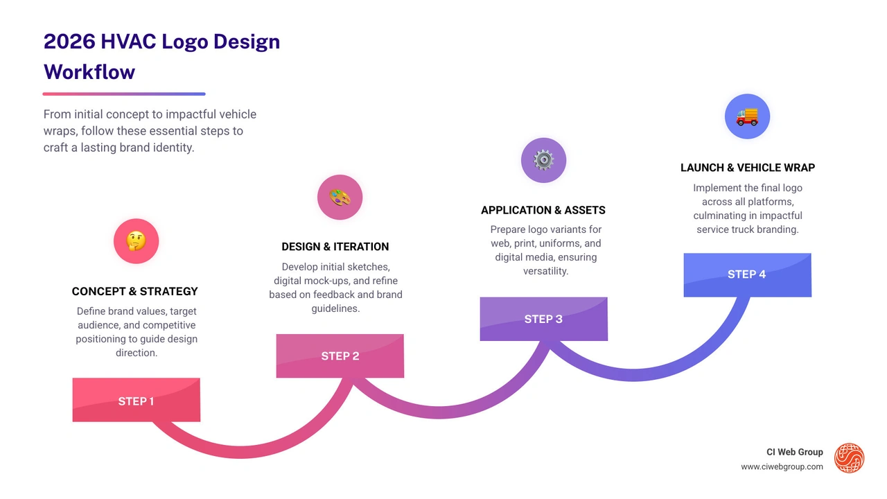
Related content about air conditioning logo design:
When we look at the most successful brands in the Southeast or Southwest, we see a recurring set of "visual shorthand" elements. These icons are used because they bypass the need for reading; they tell the brain exactly what the company does within milliseconds.
The foundational HVAC Logo Design usually incorporates one or more of the following:

You might wonder why so many HVAC companies use the sun and snowflake combination. It’s not just a lack of creativity; it’s a strategic business move. Most contractors in regions like Houston, Texas, or the Southeast provide year-round services.
A logo that only features a snowflake might make a homeowner overlook you when their furnace breaks in January. By blending the sun (heat) and the snowflake (cool), you establish your business as a "dual-service" provider. This thermal contrast creates a balanced visual that communicates seasonal versatility. It tells the customer, "We keep you comfortable no matter what the thermometer says."
While temperature symbols are standard, incorporating fans or propellers adds a layer of industrial precision. A fan icon suggests mechanical expertise. It moves the brand away from just "feeling cold" to "engineered comfort."
Stylized wind currents or "swooshes" can also represent air filtration and purity. In 2026, indoor air quality is a major concern for homeowners. Using sleek, flowing lines can subtly suggest that your systems provide fresh, clean, and circulating air, rather than just stagnant cold.
Color is the silent salesman of your brand. In home services, we rely heavily on the psychology of color to evoke specific feelings. If you want to dive deeper into how these colors interact, check out our Heating and Cooling Logos Ultimate Guide.
| Color | Emotional Response | HVAC Application |
|---|---|---|
| Icy Blue | Calm, Freshness, Cleanliness | Primary color for AC and cooling |
| Vibrant Red | Warmth, Urgency, Power | Primary color for heating and emergency repair |
| Orange/Yellow | Energy, Comfort, Sunlight | Secondary color for heating or maintenance |
| White/Silver | Purity, Modernity, Precision | Used for negative space or high-tech appeal |
The most professional air conditioning logo design often uses a split-complementary color scheme. By pairing a deep navy or icy cyan with a punchy orange or red, you create high contrast. This contrast isn't just pretty—it's functional. It makes the logo pop against the white or black background of a service van.
Gradient transitions are also becoming popular in 2026. A gradient that shifts from a "hot" orange to a "cool" blue within a single icon can beautifully represent the concept of climate control and thermal balance.
Is your business focused on high-end new installations, or are you the "emergency repair" experts? Your logo should reflect this.
The "sea of sameness" is a real problem in the HVAC industry. To stand out in the Pacific Northwest or the Southeast, many brands are moving toward Modern HVAC Logo styles.
In the age of mobile apps and small social media profile pictures, simplicity is king. A logo with too many tiny details will become a blurry mess on a smartphone screen. Modern trends favor:
Negative space is a designer's secret weapon. This is when the "empty" space around or inside an icon forms a second shape. For example, the space between two fan blades might form a house, or the center of a snowflake might reveal a wrench. This level of cleverness makes your brand more memorable and signals a higher level of professional attention to detail.
A logo doesn't just live on your website. It has to work everywhere. For a comprehensive look at how to apply your brand, see our guide on HVAC Logos for Business.
Your air conditioning logo design needs to be a "chameleon." Here is how we ensure versatility:
We often see startups make the same mistakes. Avoid these to save yourself a rebrand down the road:
Snowflakes, suns, fans, and house outlines are the most prevalent icons. They provide immediate context to the customer that the business handles climate control and home comfort.
Blue represents cooling, freshness, and tranquility, while red or orange denotes warmth and heating. Using both allows a single logo to communicate that the company provides year-round, all-season services.
Focus on high-contrast colors and bold, thick lines. Avoid thin fonts or subtle gradients that disappear in bright sunlight. Ensure the most important part of the logo—the icon and the company name—is large and legible from a distance.
Your logo is the "face" of your business. In a competitive industry like HVAC, a professional air conditioning logo design is the first step toward dominating your local market. Whether you are in Houston, Texas, or the Pacific Northwest, your brand needs to evoke trust, comfort, and expertise.
At CI Web Group, we specialize in data-driven branding and home service marketing. We don't just make things look pretty; we build identities that help you win more jobs and achieve complete transparency in your marketing ROI. If you're ready to elevate your brand, explore our branding services and let's design your breeze together.
Search our Blog
5 min read
Designing Your Breeze: HVAC Logo Ideas That Stand Out
Design a standout air conditioning logo! Explore essential elements, color psychology, modern trends, and practical tips for a versatile brand identity.
Read more
5 min read
How to Build an HVAC Brand That Doesn't Blow Cold Air
Build a standout HVAC brand with expert Branding for HVAC tips: logos, consistency, digital activation & ROI strategies for 2026 growth.
Read more

5 min read
Beyond the Acronyms: Understanding KPI and SLA Reports
Master KPI and SLA reports: Track performance, ensure compliance, and drive IT service success with essential metrics and best practices.
Read more

5 min read
The New Google Search Is Here: Will Your Home Service Business Still Show Up?
Google just changed Search forever. Discover the 3 critical steps home service contractors must take right now to stay visible to AI search agents.
Read more