
5 min read
The Complete Guide to Plumbing Website Design
Discover expert plumbing website design strategies that boost conversions, mobile performance, and local SEO for your plumbing business.
Read more
November 14, 2025
Roofing and construction logos are more than just pictures—they're the visual handshake that introduces your business. When someone sees your logo, they form an instant impression of your company's professionalism, quality, and trustworthiness.
Key principles for effective roofing and construction logos:
In the home services industry, a strong logo builds instant credibility and sets you apart from competitors. It tells customers you're established and professional, often before they even read your company name.
A well-designed logo differentiates your brand in a crowded market. Your logo works 24/7 to communicate your company's unique value on every customer touchpoint, from your website to your service vehicles, creating consistent brand recognition that drives growth.
I'm Jennifer Bagley, CEO of CI Web Group. I've spent years helping contractors future-proof their businesses through strategic branding. I've seen how effective roofing and construction logos become powerful tools for growth when designed with intention.

An effective roofing and construction logo isn't just about looking nice; it's a strategic foundation for your brand identity that helps your business grow. A winning logo is built on core elements that ensure it works hard for your business across every customer touchpoint.
Simplicity is your secret weapon. The most powerful logos are often the simplest. A clean, uncluttered design cuts through the noise when a homeowner drives past your truck or scrolls your website. Simple doesn't mean boring—it means focused and effective.
Memorability makes the difference between being considered and being forgotten. When a homeowner's roof starts leaking, will your logo come to mind? A memorable logo combines simplicity with a unique visual element that sticks with people.
Versatility ensures your logo performs everywhere. It needs to look fantastic on your website, social media, business cards, and work trucks. It should maintain its impact in full color, black and white, or reversed out on a dark background.
Scalability goes hand-in-hand with versatility. A properly designed logo can be enlarged to billboard size or shrunk to a favicon without becoming distorted. This is why professionals use vector graphics, which ensure your logo stays crisp at any size, protecting your professional image.
Brand relevance connects your visual identity to your business. Your logo must reflect what your company does and the values you stand for. A high-end custom builder's logo should communicate sophistication, while a storm restoration company might emphasize speed and reliability.
Timeless design protects your investment. Trends come and go. A truly effective logo avoids elements that will look dated in a few years, saving you from costly rebranding and preserving the brand recognition you've worked hard to build. Boost Roofing Marketing with Branding by building this solid foundation from the start.
These elements work together to build a visual cornerstone for your business identity—one that communicates professionalism, builds trust, and drives customer recognition.

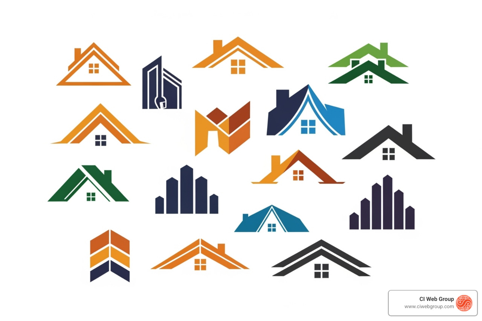
There are several proven logo types that work well in our industry, each with distinct advantages.
Wordmarks put your company name front and center, using a distinctive font. This approach is direct, clear, and excellent for building name recognition, especially if your company name is unique.
Lettermarks simplify longer names by using initials or an abbreviation. This creates a compact, memorable mark perfect for small applications like social media profile pictures.
Combination marks offer the best of both worlds and are the most popular choice in this sector. They blend your company name with a visual symbol, providing both name recognition and a memorable icon.
Emblem logos create a badge of trust by encasing your company name within a symbol. Emblems naturally convey tradition and trustworthiness, making them a great fit for brands wanting to feel established and dependable.
Mascot logos add personality and approachability with an illustrated character. Mascots are fantastic for standing out and creating an emotional connection with homeowners.
In the roofing and construction world, your reputation is everything. Your logo needs to communicate that you're worthy of a customer's trust before you even shake hands.
Your logo is a silent promise of professionalism and reliability. A polished design signals that you take your business seriously and will bring the same care to a customer's project.
Design elements speak louder than words. Strong, precise lines suggest precision in your work. A balanced composition reflects attention to detail. These visual cues create a gut feeling that influences whether a customer calls for a quote.
Durability is in your DNA, and your logo should reflect that. Using robust geometric shapes and solid visual elements can evoke a sense of permanence and strength.
Strong shapes build confidence. Geometric forms like squares, rectangles, and triangles (especially those echoing rooflines) naturally convey stability and structure. They feel grounded and reliable.
Clean lines and balanced composition suggest an organized, professional company that pays attention to details and executes with precision.
Safety and protection can be communicated with elements like shields or fortress-inspired imagery, which subtly convey security—a key benefit for anyone investing in roofing or construction. Your logo is a visual assurance of your company's integrity and expertise, which is vital in Industries like Construction.
When creating roofing and construction logos, you're not just picking nice colors and fonts. You're crafting a visual language that speaks to your customers' emotions and expectations. Every design choice tells a story about who you are.
Before a customer calls you, they might see your logo on a truck. In that split second, they form an opinion about your professionalism and reliability. This is where a strong brand identity creates a genuine connection that works for your business every day.

Color is psychological. The colors in your roofing and construction logos can make customers feel secure, energized, or modern before they even read your name.
Research shows that about 95% of successful brands use just one or two colors in their logos. This creates effective brand recognition without overwhelming the eye.
Fonts have personalities. The typography in your logo instantly communicates whether you're traditional or modern, approachable or corporate.
Above all, your logo must be legible at any size and on any surface. If customers can't read your name, the logo isn't doing its job. Your font should also reflect your unique brand personality. You can find font inspiration here to explore what speaks to your brand's voice.
Symbols are visual shorthand, creating an immediate connection with your audience.
While common symbols provide instant recognition, the key is to create something unique. This might mean stylizing a traditional element or developing a custom icon that becomes synonymous with your brand.
Avoid generic clipart at all costs. It's the fastest way to look unprofessional and forgettable, especially if your competitors are using the same images. Explore roofing logo images for inspiration, but always aim for a custom design that makes your brand truly unforgettable.
Creating a roofing and construction logo is about designing a visual asset that performs brilliantly everywhere, from the tiny favicon on your website to the massive wrap on your work truck. This is where the technical foundation of logo design is as important as the creative vision.
This may sound technical, but it's crucial: your logo must be created in a vector format. Most images online (JPEGs, PNGs) are raster images made of pixels. When you enlarge them, they become a blurry, pixelated mess.
Vector graphics are different. They're built with mathematical paths, not pixels. This means they can be scaled to any size—from a business card to a billboard—and every line stays perfectly crisp and sharp.
This infinite scalability is essential for versatility in marketing materials. A vector logo (in formats like .AI or .EPS) ensures your brand maintains a consistent, professional impression everywhere. This consistency builds trust, as it shows you are established, reliable, and detail-oriented. This foundational approach is what we emphasize at our Branding Agency for Home Services to set you up for long-term success.

Having worked with home service companies for years, I've seen every logo mistake. The good news? They're all avoidable.
The visual language for a homeowner is different from what appeals to a commercial developer.
Consider your long-term business goals. If you serve both markets or plan to expand, a versatile design that isn't too niche will serve you better.
Can you just use an online logo maker? Here's the honest breakdown.
DIY logo tools are fast and cheap, but you're trading away uniqueness and strategy. Most use templates, so your logo may look like dozens of others. They often provide low-resolution files that aren't scalable for professional use like vehicle wraps or large signage.
Working with a professional designer is a strategic investment. A designer digs deep into your business, customers, and goals. They bring expertise in color psychology, typography, and brand strategy to create a unique, timeless, and versatile logo. You receive high-quality, scalable vector files for all your needs.
The return on investment is real. A professional logo builds credibility, helps justify premium prices, and creates consistency across all your marketing. At CI Web Group, we see branding as the foundation of business growth. A professionally designed logo isn't a luxury—it's a cornerstone. You can learn more about our approach on our About Us page.
Your logo works for you 24/7. The question isn't whether you can afford professional design—it's whether you can afford not to.
We often get asked common questions about roofing and construction logos. Here are some of the most frequent inquiries and our expert insights.
A good roofing logo is simple, memorable, versatile, and relevant. It should be instantly recognizable and look great on everything from a business card to a truck. It uses strong, legible typography, a strategic color palette (like blue for trust), and unique imagery that communicates professionalism while avoiding generic clipart. A good logo works seamlessly across all marketing materials, from truck wraps to websites.
The most effective layouts are typically horizontal or square. These formats are highly versatile for signage, uniforms, and digital platforms. Many companies choose a combination mark (an icon paired with the company name) or a strong wordmark (the name in a distinctive font). The key is a clean, balanced layout that ensures maximum readability.
A logo's adaptability depends on it being created in a vector format (like .AI or .EPS). Unlike pixel-based images (JPEGs), vector graphics can be scaled to any size without losing quality. This means your logo will remain perfectly crisp and clear whether it's a tiny website icon, embroidered on a uniform, or blown up for a billboard, ensuring brand consistency everywhere.
Your logo is far more than an image—it's the cornerstone of your brand identity. Every time a potential customer sees your roofing and construction logo, it's working to communicate your commitment to quality, professionalism, and trust.
Think of your logo as a strategic investment in your company's future. It's an asset that builds recognition over time. That recognition translates into trust, and trust translates into business growth.
In the competitive world of home services, a well-crafted logo makes you memorable. It differentiates you from other contractors and communicates your value before you ever shake a client's hand.
Creating a powerful brand that dominates your market requires expertise and strategy. That's where partnering with experts makes all the difference.
At CI Web Group, we specialize in data-driven branding and marketing services designed for home service companies like yours. We understand the roofing and construction industries and know what it takes to build a brand that doesn't just look good—it performs. Our approach combines strategic thinking with creative execution to help you achieve your business goals.
Whether you're starting from scratch or refreshing an outdated logo, we're here to help you build a brand that lasts—one that earns trust, generates recognition, and helps you dominate your market.
Search our Blog
5 min read
The Complete Guide to Plumbing Website Design
Discover expert plumbing website design strategies that boost conversions, mobile performance, and local SEO for your plumbing business.
Read more
5 min read
5 Ways to Find a Reliable Plumber Fast
Discover plumbing website content strategies that help homeowners find a reliable plumber fast with mobile-friendly design and trust signals.
Read more
5 min read
The Definitive Guide to HVAC Vehicle Wraps
Discover how HVAC vehicle wraps boost brand visibility, generate leads, and build trust with professional fleet graphics that deliver lasting marketing results.
Read more
5 min read
Step-by-Step Guide to Reliable Pest Control Marketing
Discover how pest control marketing services can boost local visibility, generate leads, and drive recurring revenue with proven strategies for 2026.
Read more