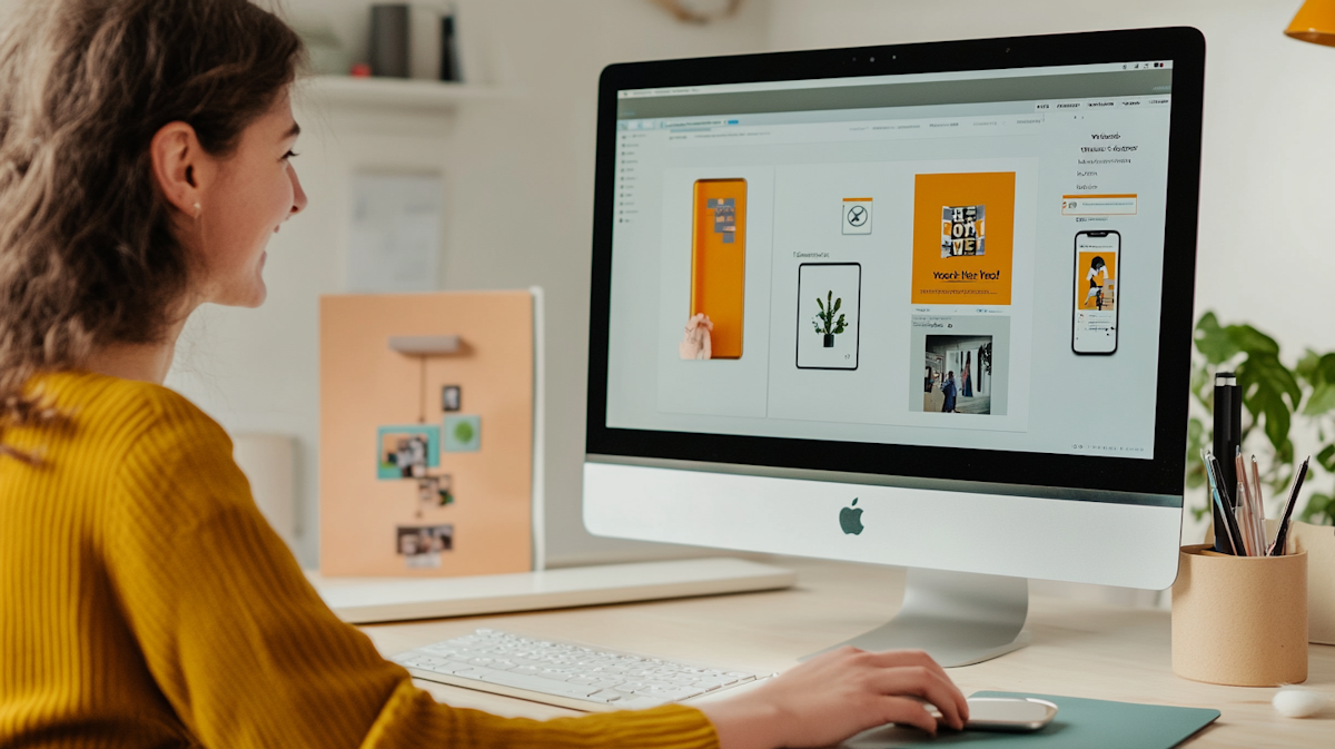
At CI web Group, we’ve been helping Companies grow their businesses online since 2008. We’ve worked alongside dealers and distributors for some of the world’s largest manufacturers, developing digital strategies that generate leads, increase bookings, and maximize return on marketing investments.
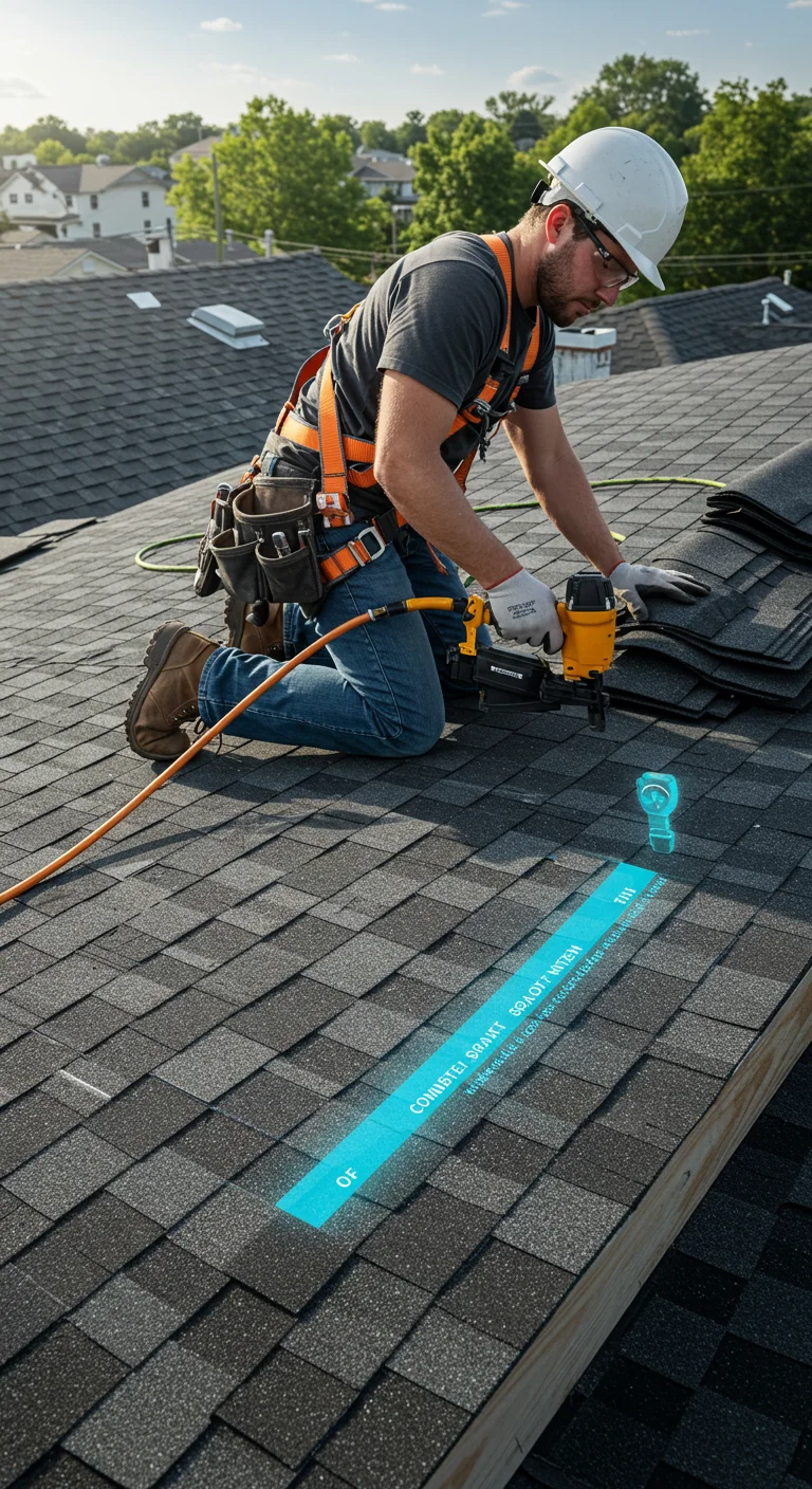
WHAT WE DO FORHVAC CONTRACTORS

OPTIMIZATION
Dive deeper into our full suite of marketing services.


- Automated message and phone call response systems (including AI CSR).
- After-hours lead handling.
- Real-time booking workflows.
- Map pack & SGE optimization.
- Ongoing testing of new AI tools and search behavior models.
Your Brand Is More Than a Logo
When homeowners need a plumber, an HVAC technician, or a lawyer, they have dozens of choices. Why should they pick you? It’s not because you use the same stock logo every other contractor downloaded. It’s not because your business card has a generic swoosh. It’s because your brand tells a story, stands for something, and stays consistent everywhere they encounter you. That’s what effective Home Service Branding looks like: a cohesive identity that reinforces your reputation and values.
Too many home-service and professional firms treat branding as an afterthought. They slap a generic logo on their trucks, post a few images on social media, and call it a day. Then they wonder why their ads blend in, their trucks don’t get noticed, and their reputation never quite takes off. A brand is not a logo— it’s a complete identity that conveys your values, personality, and promise. Without it, you’re just another name in the phone book.
At CI Web Group, we’re here to change that. We’ve spent nearly two decades helping service businesses craft brands that inspire trust, command attention, and support long-term growth. We don’t just design logos; we build identities—using data, AI, and deep industry experience to align every element of your business with your story. Whether you need a full Home Service Branding overhaul, a Home Service Logo Design, or a custom Home Service Graphic Design package, we transform brands from invisible to unforgettable.
Why Branding Matters for Home Services & Professional Firms
First Impressions Are Made in Seconds
Whether someone sees your truck at an intersection, stumbles across your website, or hears your radio ad, they make a judgment almost instantly. In those few seconds, your brand either signals professionalism and trustworthiness or causes potential clients to keep looking. For service businesses, trust is everything. Homeowners are letting you into their homes. Legal and financial clients are entrusting you with personal or sensitive information. A clear, professional brand—especially well-executed Home Service Branding—conveys that you’re reliable and serious about what you do.
Consistency Builds Credibility
Most companies’ branding starts strong, then unravels. Their website uses different fonts than their business cards, uniforms don’t match the logo on their vans, and social media posts follow no consistent style. This inconsistency confuses potential clients and undermines credibility. A strong brand is consistent across every touchpoint—online and offline. When your website, social media, service invoices, and technician uniforms all match, you create familiarity and trust. A well-defined Home Service Branding strategy ensures people feel like they know you, making them more likely to call you when they need help.
Brands Reduce Price Sensitivity
In saturated industries, price is often the default differentiator. Contractors undercut each other by a few dollars, only to struggle when margins disappear. A well-defined brand changes the conversation. When customers value what you stand for—reliability, quality work, transparent pricing, or eco-friendly practices—price becomes less important. They’ll pay more for a brand they trust because they see it as an investment in peace of mind.
Brands Attract Better Employees
Branding isn’t only outward-facing; it shapes company culture. A strong brand attracts the type of employees you want—skilled, motivated professionals who believe in your mission. When your team rallies around a clear identity and values, they deliver better service and represent your brand proudly. This reinforces the brand for customers and creates a positive feedback loop.
Branding Supports Marketing Channels
SEO, PPC, and social media become more effective when aligned with a strong brand. A cohesive brand message improves click-through rates on ads, increases social engagement, and reduces bounce rates on your website. People recognize your brand quickly and know what to expect, making them more likely to click, call, or sign up. Great Home Service Branding also enhances organic search performance because searchers see consistent signals across all channels.
Our Branding Approach – More Than Just Design
Brand Discovery & Strategy
Every great brand starts with understanding who you are and who you serve. We begin with discovery:
- Stakeholder interviews – We talk with owners, managers, and frontline staff to understand the company’s history, mission, values, and goals. We identify what makes your business unique and how you want to be perceived.
- Audience analysis – We build customer personas by researching your ideal clients. What motivates them? What are their pain points? What do they value most in a service provider? Understanding your audience helps us craft messaging that resonates and informs your Home Service Branding.
- Competitive analysis – We look at your competitors’ branding—logos, color palettes, messaging, and positioning. We find the gaps and opportunities. If every plumber in town uses blue and red, maybe your brand stands out with a different palette. If all law firms use stiff and formal language, perhaps a humanized approach differentiates you.
- Brand positioning – We define your unique value proposition and core messaging. What promise do you make to your clients? For example, are you the dependable 24/7 emergency plumber, the eco-friendly HVAC installer, or the compassionate family law firm? A clear positioning statement guides every branding decision and underpins your Home Service Logo Design.
This strategy ensures that your brand is authentic, memorable, and aligned with your business goals.
Name & Tagline Development
If you’re launching a new business or rebranding, the name and tagline matter. We brainstorm options that:
- Reflect your industry without sounding generic.
- Are easy to spell and remember.
- Don’t limit you geographically if you plan to expand.
- Can be trademarked and stand the test of time.
We craft taglines that sum up your value proposition in a few words. A great tagline differentiates you and sticks in customers’ minds. For example, a pest control company might use “Protecting Your Home, Naturally” to emphasize eco-friendly solutions, while an electrical contractor might opt for “Powering Your Peace of Mind.”
Visual Identity Design
This is where your brand takes shape visually. Our design process includes:
- Logo design – We explore multiple concepts, from simple monograms to symbolic icons. We test how your logo looks on business cards, uniforms, trucks, and digital media. A great logo is versatile; it scales to small sizes like favicons and looks clear on large signs. For contractors, this is the heart of Home Service Logo Design, ensuring your identity is recognizable on your fleet and uniforms.
- Color palette – Colors evoke emotions and convey meaning. Blue can signal trust and reliability; green can signal eco-friendliness. We choose a palette with primary, secondary, and accent colors that work in print and digital formats.
- Typography – Font selection is more than aesthetics; it affects readability and tone. We choose primary and secondary typefaces that align with your brand personality—whether that’s modern, traditional, playful, or authoritative.
- Imagery and iconography – We establish guidelines for photography, illustrations, and icons. For a landscaping company, this might mean using natural, vibrant photos of gardens and lawns. For a law firm, it might involve clean, professional portraits and subtle symbolic icons. These elements form the backbone of your Home Service Graphic Design.
We refine these elements through feedback cycles, ensuring you love the final result and that it resonates with your target audience.
Brand Voice & Messaging
Visuals catch attention, but words build relationships. We develop a brand voice that reflects your personality and connects with your audience. This includes:
- Tone of voice – Are you warm and friendly, authoritative and direct, or witty and conversational? Your tone should remain consistent across channels.
- Key messages – We outline the core messages you want to communicate. These might include your mission, your values, your service guarantee, or your commitment to sustainability.
- Storytelling – We craft narratives about your origin, your team, and your successes. Humans connect with stories. A compelling origin story—perhaps the founder learned plumbing from their father and has been serving the community for decades—gives your brand depth. Good storytelling is as important as good Home Service Branding because it reinforces authenticity.
Brand Guidelines & Playbook
Consistency is critical. We produce a brand guide that documents everything—logo usage, color codes, typography rules, tone of voice examples, imagery guidelines, and templates for business cards, letterheads, social posts, and presentations. This guide acts as a manual for anyone creating branded content, ensuring that your brand looks and sounds the same whether it’s on a billboard or Instagram.
We also provide a digital brand playbook with templates and assets ready for your team to use. This includes PSD files, Illustrator files, and Canva templates, making it easy to stay on-brand without needing a designer for every social post. These resources ensure your team can create Home Service Graphic Design content quickly and consistently.
AI‑Enabled Brand Strategy – Harnessing Data for Design
At CI Web Group, branding isn’t just an art—it’s a science. We leverage artificial intelligence to enhance creativity and ensure decisions are grounded in data rather than gut feelings.
Competitive & Market Intelligence
Our AI agents scan competitors’ websites, social media, ads, and marketing materials. They analyze color usage, messaging trends, and visual styles across your industry. This helps us identify overused patterns and find opportunities to differentiate. If your competitors are all focusing on speed, maybe your brand emphasizes craftsmanship and reliability. If everyone uses dark palettes, perhaps a bright, cheerful color scheme stands out in the world of Home Service Branding.
Color and Typography Analysis
Color psychology influences perception. AI tools analyze the emotional and cultural associations of colors and suggest combinations that match your desired brand personality. They also evaluate readability across devices and platforms. Similarly, AI helps test typefaces for legibility and aesthetic fit, ensuring your text is easy to read in print, on signs, and on mobile screens. This analysis is particularly valuable for Home Service Graphic Design, where legibility on trucks or yard signs is crucial.
Audience Sentiment & Persona Building
We use AI to mine reviews, social conversations, and demographic data to understand how people talk about your brand, your services, and your industry. This sentiment analysis reveals what customers love and what frustrates them. We build detailed personas—complete with goals, challenges, and preferred communication channels—that guide brand tone and messaging. For Home Service Branding, knowing what homeowners value most helps us tailor messaging that resonates.
Logo & Design Variations
AI doesn’t replace designers, but it speeds up ideation. We use algorithms to generate many logo variations quickly, then refine the best concepts manually. AI can predict how different designs will perform in terms of recognition and recall, helping us narrow options faster. This gives you more choice and better final designs for your Home Service Logo Design.
Brand Performance Monitoring
Brand perception evolves. Our AI agents monitor brand mentions, reviews, and social engagement to track sentiment over time. If a certain ad campaign shifts perceptions positively, we note the elements that resonated (tagline, colors, imagery). If negative feedback increases after a logo change or messaging tweak, we detect it early and adjust. Continuous monitoring ensures your Home Service Branding stays aligned with audience expectations.
Brand Collateral & Implementation
Once your visual and verbal identity is defined, it’s time to roll it out. We handle all aspects of brand implementation to ensure consistency and impact.
Logo & Signage Application
Your logo appears on trucks, uniforms, business cards, invoices, email signatures, website headers, and social profiles. We provide artwork and placement guidelines for each use case. We also design vehicle wraps, yard signs, billboards, and indoor signs, ensuring your brand is visible wherever you operate. Strong Home Service Logo Design means your vans are rolling billboards that instill trust wherever they go.
Print & Promotional Materials
Even in a digital age, print materials matter—especially for service businesses. We design:
- Business cards that make an impression and reflect your brand’s professionalism.
- Letterheads and envelopes for formal communication.
- Brochures and flyers that highlight services, membership plans, or special offers.
- Presentation folders and proposal templates for professional firms.
- Apparel and uniforms that make your team recognizable and reinforce trust.
We coordinate with printers and vendors to produce high-quality materials that last. All of these are anchored in consistent Home Service Graphic Design, so every piece reinforces your identity.
Digital Assets
From web banners and display ads to email templates and social media graphics, digital assets drive awareness and conversions. Our templates make it easy for your team to create on-brand digital content quickly. We also provide animated logo versions for video intros or motion graphics, and icon sets for app or web development. Whether you’re designing posts for Instagram or banners for Home Service Branding campaigns, you’ll have the right tools.
Environmental & Experiential Branding
Your office or showroom is part of your brand experience. We design office signage, front-desk displays, wall graphics, and wayfinding systems that align with your visual identity. For events or trade shows, we produce pop-up displays, tablecloths, and promotional swag that showcase your brand consistently. These elements amplify your Home Service Branding in the physical world.
Digital Brand Consistency
Branding doesn’t stop at the design stage. To build trust and recognition, every digital touchpoint must look and feel consistent.
Website Alignment
Your website is often the first in-depth interaction people have with your brand. We ensure your site reflects your visual identity and tone of voice. Colors, fonts, and imagery align with your brand guidelines. CTA buttons, navigation labels, and on-page messages use your approved tone and language. We also optimize site structure, load speed, and accessibility to ensure a seamless user experience. Good Home Service Branding shows up when visitors instantly recognize they’re in the right place.
Social Media Cohesion
Scrolling through your feed should feel like turning the pages of your brand story. We create covers, profile images, and post templates that reflect your visual identity. We standardize filters or color overlays for photos, so your feed looks cohesive rather than random. Captions follow your brand voice, whether that’s playful and conversational or authoritative and informative.
Advertising & Marketing Materials
From Google Ads banners to print mailers, your brand must shine through. We design ad variations that fit different formats while maintaining consistent branding. Landing pages connected to ads use the same colors and fonts as your main website, avoiding disjointed experiences that lower conversion rates. Cohesive Home Service Graphic Design across all ads ensures your message is unmistakable.
Email & SMS
Newsletters, promotional emails, and SMS campaigns carry your brand voice directly into people’s inboxes and phones. We design email templates with branded headers, footers, typography, and color accents. We script SMS messages that reflect your tone and abide by character limits while conveying value. These formats benefit from thoughtful Home Service Branding to make each message consistent and compelling.
Brand Reputation & Experience
Branding isn’t just how you look and sound—it’s how you make people feel. Great branding creates a consistent, positive experience at every touchpoint.
Customer Experience & Service
A strong brand promise must be kept. If your brand promise is “Reliable, on‑time service—every time,” your dispatch and customer service operations need to support that. We collaborate with your teams to ensure your processes, policies, and training align with your brand values. When a technician arrives in a sharp uniform with a smile and fixes the issue efficiently, they reinforce your brand as dependable.
Review Management & Social Proof
Reviews shape perception. We implement systems that encourage satisfied clients to leave positive reviews on Google, Yelp, Facebook, and industry-specific directories. We also monitor and respond to reviews, addressing concerns swiftly and professionally. An honest, empathetic response to a negative review often impresses potential customers more than the review itself.
Brand Surveys & Feedback
Periodically, we send surveys to past customers to measure brand perception. We ask how they found your business, what stood out, and where improvements could be made. We measure Net Promoter Score (NPS) and qualitative feedback. This helps us spot opportunities to refine messaging, service, or even expand offerings. Strong Home Service Branding should be monitored like any other business asset.
Employee Engagement
Your employees are brand ambassadors. We involve them in brand training so they understand the company mission and values. Empowered employees deliver better service, speak positively about the company, and create memorable experiences for customers. We also collect internal feedback—if technicians find the new uniform uncomfortable or staff feel the new tagline doesn’t reflect daily life, we adjust.
Brand Measurement & Growth
What gets measured gets improved. Unlike branding agencies that hand off a logo and disappear, we track brand performance over time.
Brand Awareness & Recall
We monitor direct traffic to your website, branded search terms (e.g., people searching your company name), social mentions, and referral sources. Increases in these metrics indicate growing brand awareness. Surveys and focus groups help measure recall—can people describe your brand’s key message? Do they remember your tagline? Good Home Service Branding should be memorable and easy to recall.
Brand Equity & Perception
Over time, we evaluate how customers and prospects perceive your brand. Do they associate you with reliability, friendliness, expertise, or value? Are you top-of-mind for emergencies? By measuring sentiment, we adjust messaging and customer experience elements to align perception with your desired positioning.
Marketing Synergy
Branding isn’t an island. We ensure your brand works in synergy with your SEO, content marketing, advertising, and social media efforts. If your SEO strategy drives traffic but your site doesn’t reflect your brand, visitors bounce. If your ads look off-brand, click-through rates drop. By aligning branding with all other marketing activities, we improve overall performance and ROI. A cohesive Home Service Branding strategy amplifies every marketing channel.
Myths & Mistakes to Avoid in Branding
- “A logo is a brand.” A logo is a symbol that represents your brand. Your brand encompasses your values, your promise, your visuals, your voice, and the experience you deliver. Don’t reduce it to a graphic, especially in the world of Home Service Branding where identity must connect across all customer touchpoints.
- “Branding is a one-time project.” Your brand evolves as you grow and as the market changes. You should revisit and update your brand periodically to stay relevant and reflect your current offerings.
- “Any designer can design a logo.” Designing a logo without a brand strategy is like building a roof with no foundation. If it doesn’t align with your positioning or audience, it won’t resonate. Proper Home Service Logo Design requires research, strategy, and thoughtful execution.
- “I can’t afford branding.” Poor or inconsistent branding costs you more in lost opportunities and low conversion rates than investing in a professional brand. A strong brand attracts the right customers, reduces price sensitivity, and lowers marketing costs over time.
- “Changing my brand will confuse customers.” If your current brand confuses or fails to connect with customers, change is necessary. A well-planned rebrand—or even a refresh—can clarify your message and attract new business. The key is communicating the change clearly and consistently.
Quick Insights & Highlights
- A strong brand makes your company memorable and differentiates you from competitors.
- Consistency across all touchpoints builds credibility and trust.
- A clear brand promise reduces price sensitivity, allowing you to compete on value rather than cost.
- Branding isn't static—it evolves with your business and audience expectations.
- Branding affects internal culture as much as external perception; engaged employees become advocates.
3‑Step Branding Process
Our branding service follows a proven framework:
- Discovery & Strategy – We learn everything about your business, audience, and competitive landscape. We clarify your brand positioning and core messaging through workshops, interviews, and research.
- Design & Development – We create your visual and verbal identity: logo, color palette, typography, brand voice, messaging pillars, and brand guidelines. We refine designs based on feedback and ensure alignment with your strategy. Our process ensures that Home Service Logo Design and Home Service Graphic Design reflect your personality and appeal to your customers.
- Deployment & Evolution – We roll out your brand across touchpoints: website, vehicles, uniforms, print materials, social media, and advertising. We provide a brand playbook for your team and monitor performance. We adjust messaging or visuals as needed based on feedback and market changes. This keeps your Home Service Branding fresh and relevant.
This process ensures your brand reflects who you are today and supports where you’re going tomorrow.
Success Scenario: Rebranding an Electrical Contractor
Let’s illustrate the power of branding with a case study. “Bright Circuit Electrical” had been in business for years. Their logo was clip-art lightning, their trucks were mismatched, and their website looked straight out of the early 2000s. They felt stuck in a race to the bottom on price and struggled to attract skilled technicians.
Step 1 – Discovery: We interviewed the owners, electricians, and a handful of clients. We learned that Bright Circuit’s true strength was craftsmanship; they took the time to do things right and solve problems others couldn’t. Customers praised their thoroughness and explained how they felt safe letting these electricians into their homes.
Step 2 – Strategy: We positioned Bright Circuit as “The Trusted Electrical Experts.” Their brand promise: safety, quality, and peace of mind. We crafted the tagline “Powered by Precision” to convey attention to detail.
Step 3 – Design: We designed a new logo using clean lines and a subtle electrical bolt forming a shield—representing safety and protection. The color palette combined dark navy (trust) with a vibrant accent color to modernize the look. We selected a legible, professional typeface and wrote messaging that emphasized safety, certification, and thorough testing. This new Home Service Logo Design set them apart from generic lightning bolt graphics in the industry.
Step 4 – Implementation: We wrapped their vans with the new branding, redesigned uniforms, printed new business cards, and rebuilt the website. We created social media templates and a brand style guide. We added employee bios to the site to highlight the expertise behind the brand. This full Home Service Graphic Design makeover ensured every touchpoint communicated trust and professionalism.
Result: Within six months, Bright Circuit saw an uptick in larger projects and commercial clients who were willing to pay more for quality. They attracted more skilled electricians who felt proud to represent the brand. The owner reported higher confidence walking into sales meetings with the new professional materials. The rebrand didn’t just change how they looked; it changed how they felt about their own business—and how customers perceived them.
Closing & Next Steps
Branding is the foundation of every marketing and sales effort. It influences how customers perceive you, how much they trust you, how much they’re willing to pay, and how loyal they become. A strong brand is an investment that pays dividends across your website, advertising, social media, customer service, and recruitment.
At CI Web Group, we don’t just design logos—we build brands that drive growth. Using a blend of strategy, design expertise, and AI-powered insights, we create identities that are authentic, memorable, and effective. Whether you’re launching a new business, refreshing an outdated identity, or repositioning for a new market, our team is ready to help. From comprehensive Home Service Branding projects to specialized Home Service Logo Design or Home Service Graphic Design packages, we have you covered.
Let’s build something powerful together.
Frequently Asked Questions (FAQs)
Why is branding so important for home-service businesses?
Home-service businesses rely on trust. Customers invite you into their homes and trust you with their comfort and safety. A clear, professional brand communicates reliability, expertise, and care. It differentiates you from “Chuck-in-a-truck” operators and makes customers more comfortable choosing you—even at a higher price. Strong Home Service Branding is essential for growth and loyalty.
How often should I refresh or rebrand my business?
There’s no set timetable, but most businesses benefit from a brand refresh every five to seven years or when there are significant changes—new ownership, expanded services, or shifts in target market. If your brand looks outdated or no longer reflects who you are, it’s time to update it.
What’s the difference between a refresh and a rebrand?
A brand refresh is a subtle update—tweaking your logo, refining your color palette, modernizing fonts, or adjusting your messaging to better reflect your current focus. A full rebrand involves a complete overhaul—new name, new visual identity, new positioning, and sometimes a new mission. A refresh retains familiarity, while a rebrand signals a larger transformation. A targeted Home Service Logo Design can be part of either, depending on your needs.
How do I know my new brand will resonate with my audience?
We base our decisions on research and testing, not guesses. We interview your customers, analyze your competitors, and develop detailed personas to understand what will resonate. We present multiple concepts and iterate based on feedback until we land on a brand that reflects your business and appeals to your target market.
Do I really need a brand guide?
Yes. A brand guide ensures consistency. Without clear guidelines, different teams or vendors may use different colors, fonts, or messaging, leading to a fragmented and confusing brand. The guide empowers everyone—staff, partners, and agencies—to produce materials that align with your identity and adhere to your Home Service Branding standards.
AI-Enabled & Low-Code
Our product? A modern, intelligent, and conversion-ready website that grows with your business and adapts as digital landscapes evolve.
AI-Powered listings, content strategy & SEO All Working Together
Industries we serve
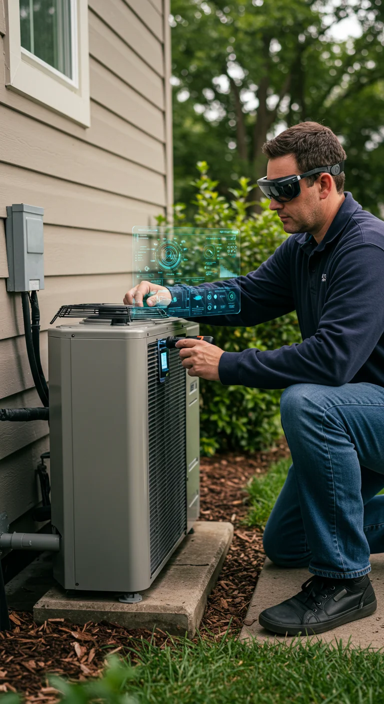
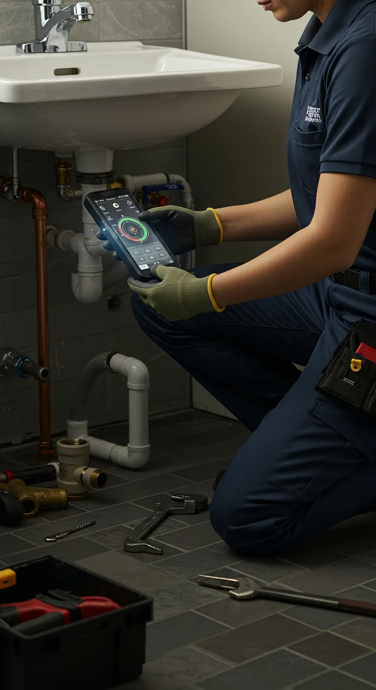
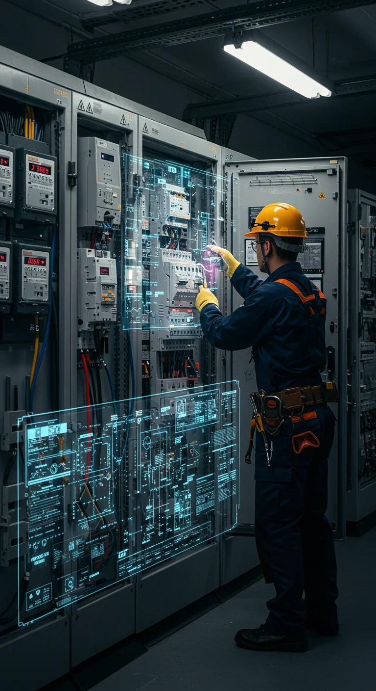
We help businesses scale with digital strategies that drive real results. From HVAC, plumbing, and electrical to roofing, solar, pest control, garage door, landscaping, and construction, our team delivers tailored solutions to boost visibility, generate leads, and fuel long-term growth.


.webp)

core SERVICES
Why CI Web Group?
CI Web Group is the go-to marketing partner for home service businesses ready to scale. We combine proven strategies with AI-powered tools and forward-thinking design to deliver measurable growth. Our all-in approach means you get cutting-edge solutions, real results, and a team committed to keeping you ahead of the curve.
-p-1600.webp.webp)
-p-500.webp.webp)
-p-800.webp.webp)
-p-800.webp.webp)
-p-800.webp.webp)
-p-1600.webp.webp)
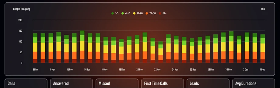
DECISIONS BACKED BY DATA, Driven by success

Let’s talk about your market, your goals, and how we can help you get ahead—and stay ahead.
Book your strategy session today.